Rethinking Slack
Slack was getting too big.
Not the company or the business, of course. Those were growing wonderfully, buoyed by our public offering. All of our usage and business metrics were going up and to the right. The good times were rolling. It was late 2019.
The product itself was getting too big. Slack was originally built around messaging, files, and search. A simple, sweet set of harmonious features that changed how people worked. Over time, Slack grew to include posts (longer documents), audio and video calls, extended platform features, and directories for all the different things on a team: people, channels, user groups and so on. Then came Threads and Reactions. Enterprise Grid and Shared Channels.
Over the years, we managed to find space for each feature as it was added. Sometimes there was a natural place to put something. Lists of all your threads and unread conversations were handy at the top of the channel list, naturally bubbling up your most essential messages. Other things were more awkward. Did access to a list of people on your team merit an entry in the main sidebar? Or a secondary view? Or should it be tucked away behind a menu?
Our users couldn’t make sense of what we were showing them. And our internal teams couldn’t figure out how their stuff should fit into the product. Each feature demanded its own entrypoint, but free pixels were becoming scarce. Features got wedged into whatever real estate was available. Temporary solutions hardened into patterns that proliferated as product teams duplicated and extended what already existed.
Instead of improving the experience of the product, new features were just accumulating atop one another. Each new user got an increasingly saturated, busy product instead of the “simpler, more pleasant, and more productive” workspace we had set out to build.
We found ourselves shipping a kitchen drawer full of useful tools to our customers – knives and forks, spatulas and whisks, tongs and corkscrews, hell even a few citrus zesters and melon ballers – but everything was so jammed together that you couldn’t find what you were looking for. Look out for the mandolin in the back.
It was a mess. We were at a tipping point of product complexity. While we were preoccupied re-engineering our codebase into a scalable service and reorganizing our company into a public-ready business, our product had suffered. Inertia, complexity, and feature creep had caught up to us. Entropy was setting in.
Despite this, our users were still happy and loved Slack. As product researcher Razan Sadeq-Keyes put it:
“I think it's fair to say that it was a mess, particularly for high traffic Slack workspaces, but it was a mess that users learned to navigate the way a New Yorker learns to put their blinders on to move through a city wrapped in scaffolding and has rats running all over its subway platforms.. but hey, they still think it’s the greatest city on earth!”
Nevertheless, we could see the cracks in our foundation, and worried about stacking any more weight on it. Just as we had reached the pinnacle of our industry, going public and achieving our years-long goal, we were at risk of letting the key to it all crumble. We needed to rethink Slack.
Rethinking how we work
The accumulation of features across the product from 2014 to 2019 was mirrored by the growth of departments in our product team. When we started the company there was only one product team. It was Stewart telling all of us what to build, and whether it was good enough to ship. We added engineers as needed, and designers to guide their work.
As we grew and new feature areas matured, this original group came to be called Core Product, complete with product managers, researchers, and all the other roles of a mature product team. Adjacent teams dedicated to Platform, Search, Enterprise, Shared Channels and so on arose to govern and grow those product areas. Each department contained sub-teams for the features under their supervision.
The number of product teams ballooned. Roadmaps for each area laid out the features they would add and be responsible for maintaining. The Core Product team took care of everything else, which included massive swaths of the product around our core featureset of channels, messaging and files. Inevitably some early features became orphaned, withering slowly but still hanging around in the dim corners of the interface (and the dusty cupboards of the codebase). Meanwhile, ambitious product managers rapidly added new territory to the product wherever they could. It became hard for even the most tuned-in folks in the company to keep track of who was building what, and how it all fit together.
What was missing was oversight of the overall product experience. Nobody owned the top-level concerns that make software usable and understandable at a fundamental level. Things like the hierarchy of features and how they should relate to one another. The core conventions for how users should navigate, and how views should be presented. The fraught decisions about what belongs at the top-level and what does not.
For the most part, the overall interface still looked and worked much as originally designed in 2013, when the product was much smaller. A purple sidebar on the left listing your channels, a list of messages in the middle, and a “flexpane” on the right for supporting information. This basic three-column structure was now supporting an ever-expanding array of additional features and new capabilities that it had never been designed for.
In software, this area of concern is known as information architecture. The overall structure of a product that allows users to make sense of it and that allows it to grow sensibly over time. We needed a framework for the app that could continue to gracefully evolve as new features arrived. And we needed a team to build that framework: the Information Architecture team.
The head chef
Stewart Butterfield was always the lead product designer at Slack. Dozens of others at the company had major influence: conceiving features, designing interfaces, and iterating on product experiences. But Slack was Stewart’s brainchild. He defined the gestalt of the product and directed all of the major evolutions to it.
He had a unique knack for knowing what the next thing should be, and pointing the company in the right direction to achieve it. He was always available to provide feedback on emerging product experiences, and never held back in giving his opinion. His criticism could be sharp, but was rarely off the mark. His praise was a sure indicator that something was on the right track.
No concept was too big or interface detail too small to escape his consideration and comment. He would share a passionately argued essay on the chief requirements our clients (apps) should prioritize (#1: “Slack clients should be fast as fuck”). Or a long explanation of how he felt Threads should work as they were being internally tested. He would often share detailed examples from other products he felt we should emulate. Or more often just a screenshot of a UI bug and a big red arrow on it labeled: “WTF?!” (Mom, that means “What’s that for?”).
It was one of his superpowers, which he wielded continuously over the years to shape Slack to fit his vision.
But as we grew, and as the external requirements on the company increased, Stewart had less time to be hands on. The product design process was increasingly federated across many product owners and working groups. The growth in the number of offices and staff at the company meant that we had more layers of management, and correspondingly more distance between our CEO and the work on the ground.
Opportunities for product review with Stewart became more scarce, and sometimes came too late in the process. In some areas quality suffered. In others there wasn’t a strong enough voice to ensure that a new feature was coherent with the rest of the product.
But with our public offering in the rearview and the major efforts to ship Grid and Shared Channels paying major business dividends, Stewart was once again able to immerse himself in the design process. Additionally, he had recently filled out his executive team with seasoned reinforcements. Tamar Yehoshua joined as CPO in January 2019 and Ethan Eismann as VP of Design in July 2019. These veteran execs were able to take on the job of running the large product and design organization, freeing up some of Stewart’s time and acting as partners for the job ahead.
With a product crisis brewing, we got our head chef back.
Rethinking the interface
The design studio at our 500 Howard office in San Francisco was a humble room on the 9th floor overlooking SoMa. It was split between a lounge space with couches, a coffee table and post-it notes, and a work space with a table, whiteboards and screen. It could fit about a dozen people comfortably.
Ethan Eismann assembled us in the studio in the fall of 2019, where Stewart awaited. Ethan had gathered together a handful of designers and engineers, product managers and researchers to tackle the project. We were a cross-section of veteran staff who had broad expertise with the product and the trust of leaders to take on a redesign. We didn’t fill the space.
Our job was to rethink Slack from the ground up. Not to invent new features or reimagine the product’s purpose. But to establish and implement a coherent structure that would rationalize what we had and pave a path toward what came next. We had to reckon with the complexity of the product as it was while anticipating the needs of the next 3-5 years of product growth.
Stewart immediately began challenging us with provocative ideas.
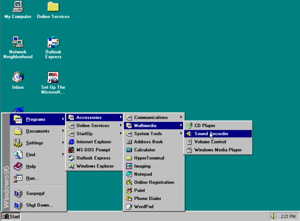
“What if we just put everything you can do in Slack into one giant menu? Like the Windows 95 start bar.”
“Windows 95?”
“Yeah, remove everything else and just build a giant menu. That way we’ll have to argue about what goes together, and how it should be sorted, and what the hierarchy is, and what the labels are. And we’ll have to make sure we have everything.”
We built it. It wasn’t a great interface, but it did catalyze conversations and arguments while making sure everyone had shared context about the scope of the product’s surface.
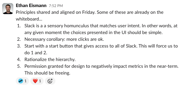
Next, Stewart introduced us to the concept of the sensory homunculus. We arrived one morning to this image on screen. Before we’d even had a sip of coffee, this guy was presenting himself to us on a 4 foot tall screen:

The sensory homunculus scales parts of the human body to represent how sensitive they are:
“Areas of the body with more complex and/or more numerous sensory or motor connections are represented as larger in the homunculus, while those with less complex and/or less numerous connections are represented as smaller. The resulting image is that of a distorted human body, with disproportionately huge hands, lips, and face.” Wikipedia
Stewart wanted us to imagine what the most and least important parts of our product were, and scale the UI for them accordingly. He stressed that comprehension and discoverability were the key obstacles to solve in order to help users understand and get the most out of Slack.
“Don’t design the interface to match what it looks like now, or to fit some existing template or design system. Don’t worry about hurting anyone’s feelings in the company if their feature gets demoted or removed. None of that matters if the person sitting in front of Slack can’t figure it out.”
He encouraged us to try out wacky UI treatments, unusual placements, exaggerated scale differences, and anything else that could help shake loose the fundamentally important parts of the product and bring them to the fore. He was happy for us to bury less important features behind menus or secondary views if the critical features – channels and messages – were obvious and comprehensible.
Stewart reiterated constantly that it was okay to ask the user to make more clicks if the choices they had were clear. He was adamant that a motivated user would figure out what Slack could do if we could reduce the decisions they needed to make up front.
He pushed us out of the comfort zone of our day to day work. Instead of taking the project on as a modest iteration, or breaking elements off piecemeal to revise in isolation, Stewart encouraged us to imagine holistic solutions without the constraints of immediate viability, conformity to convention, or even good taste. We would eventually come back to Earth, but his guidance at this stage of the project was essential to setting it on the right trajectory.
Prototyping
Our new team fell into a steady rhythm. Every day we would meet in the morning for an hour or so to talk through the broad issues and requirements, then prototype solutions in code, and finally meet with Stewart to demo late in the afternoon and evening. All options were open for exploration. We tried dozens of variations of layouts, including a new rail for feature entrypoints, nested views in the channel sidebar, and floating buttons for navigation menus.
We moved supporting “flexpane” views to overlays or pulldown menus or secondary windows. We moved search to the top of the app, to the side, or to its own tab. In each case we grouped and rearranged the various features to see what made the most sense, and tried out different labels to aid comprehension. For the first time since 2013 we had the opportunity to see the forest for the trees and reorganize things sensibly.
Our desktop codebase, designed around a set of tools and deployment processes that made it effortless to rapidly produce and share new prototypes, set us up for success. The time between “here’s an idea” and “here’s a prototype” was usually measured in hours. A day or two for the most complex directions. This eliminated the need to argue about what to try, because it was easy to try everything.
At each stage we checked our thinking against the types of users we needed to support. New users who had no idea what Slack was. Intermediate users who were using messaging but hadn’t delved into Slack’s more sophisticated features. And power users who knew exactly where everything was and relied on us for their productivity.
We had to think about brand new, clean slate teams. Small to medium sized teams with years of archives. And the largest organizations in the world with hundreds of thousands of users and millions of messages. We built prototype environments to simulate these scales and types of users, so we could assess our efforts against each.
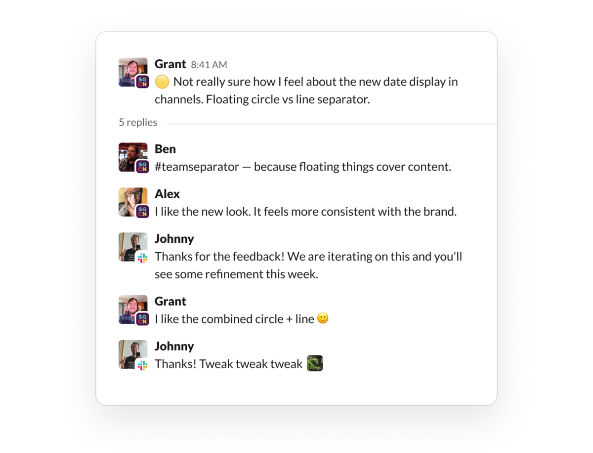
Every day, we filled up our project channel with ideas, requests for feedback, and discussion. It got busy in there. We developed a simple mechanism to make sure we were reserving most of our time for the work itself and to avoid getting stuck arguing in a thread. We started marking topics with a small set of reactions to indicate their status. Instead of debating in channel, we would roll these up into discussion topics for when we met so we could go through them as a group and make decisions:
- Needs feedback 👀
- Question ❓
- Concern 🤔
- Decision 🍤
Once decided, we’d mark a topic with a 🍤 and, for the time being, treat it as closed. We could always come back and revisit a decision, but we developed the trust of a healthy team to “disagree and commit” in order to reveal the next set of important questions. Shrimp it and move on! (Why a 🍤, you might ask? To which I would answer, why not?)
This iterative process helped us root out all the complexity that had built up and develop designs that could encapsulate it all. The active guidance from Stewart and Ethan helped avoid rabbit holes and moved us steadily toward promising directions. The data and insights that our product manager Jaime DeLanghe and product researchers brought to the table helped anchor our explorations in customer feedback and needs. Stewart continuously “tasted the soup” and was the final arbiter of competing ideas.
As the overall direction began to solidify, an IA team for mobile was spun up and integrated with ours to begin interpolating the desktop design (where our users spend the majority of their time) into a new structure and feature hierarchy for our mobile apps. Though it had a smaller feature surface area than desktop, our mobile design was also badly in need of an overhaul. It hadn’t been meaningfully updated since 2013 either.
Testing with customers
Once we had explored the space of possible directions with throwaway prototypes, we were ready to try out the most compelling ones with customers. We built out a system for toggling the production app between new variants of the design.
We gave this to a set of users from customer companies who joined us in our #slack-champions shared channel, where they could learn about the new designs and provide feedback. This gave us immediate information about whether people outside our building could understand what we were trying to do, and let them use it on their real teams with their actual messages. Our customers were thrilled to be brought into the process, and we got detailed feedback on everything from big layout changes to minor UI refinements.
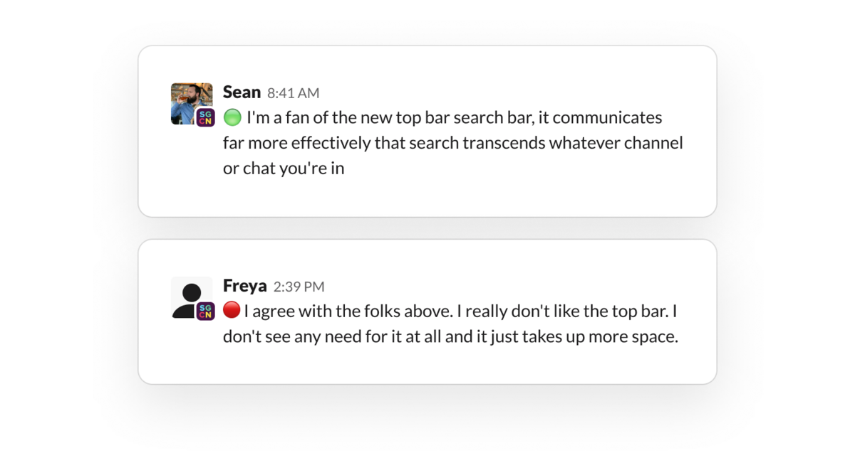
Feedback from our Slack Champions – staff at customer companies who volunteered to try out our new designs.
Simultaneously we released variants internally and got a treasure trove of feedback. This sometimes echoed customer sentiments, but often revealed power user needs and preferences that we had to incorporate or cut. It also gave internal teams lead time on what was changing so that they could adapt their designs or advocate for their feature area. This led to productive disagreements and active discussion about the relative priority of features.
Meanwhile, Raz was working through the builds with new users who didn’t have any context with Slack, making sure that we weren’t over-optimizing for existing users. Initially our designs were failing roughly half of the time, in terms of the ability for a new user to complete a list of tasks like sending a message, creating a channel, or searching for a keyword. We iterated for weeks until we were consistently seeing high completion percentages and comprehension for this set of users. This offered an essential backstop to our explorations and helped ensure we were hewing to a design that was comprehensible for newbies.
On mobile, we developed a proper Home screen for the app and tabs for the most important information people needed on the go: DMs and notifications. The outdated design style was refreshed throughout and brought up to the level of polish a modern app demanded. We circulated new mobile builds consistently and iterated as feedback poured in from beta customers and internal users.
Taken together, these mechanisms led to an incredibly rich array of live feedback that kept pace as we evolved our designs and converged on our release candidate.
Read Anna Niess and Zack Sultan’s writeup of the new design on desktop.
Building to release
As we stabilized the new information architecture, we began thinking forward to release. We knew the change could be hugely disruptive to our users. Millions of people depended on Slack for their day-to-day productivity. Though we were confident that the new design would be beneficial in the long run, we had no illusions that people would welcome significant changes in software they depended upon. Nobody opens an app they use frequently and is happy to see a redesign.
We addressed this in three ways:
First, we made the decision that two long-requested new features that had been incubating inside the company would make their debut simultaneously with the new design. We hoped this would soften the impact and sweeten people’s impressions of the change – sugar to go along with the medicine.
The two new features were the Composer and Sidebar Organization. These were developed by the core product and search teams and integrated into the new design.
Composer enabled standalone message composition (outside the context of a channel) and a list of unsent Drafts for review and editing. This matched many people’s expectations about what message composition should look like when switching from email to Slack.

Sidebar Organization allowed users to customize groups of channels in their sidebar, enabling them to make sections for projects, departments, or topics. This surprisingly complex feature had been requested for as long as we’d been building Slack. It was time to give the people what they wanted.

Second, we did a deep pass of “polish and delight” across the app. We harmonized the innumerable bits of UI that had accreted over time with differing styles. We rationalized details like border radiuses, icon sizes, and hover styles. We eliminated unnecessary duplicates, cleaned up menus and toolbars, and killed off many small vestigial appendages that had hung on. We added small touches of animation and whimsy in various interactions. We added a set of snazzy themes that looked great on the new interface. We made everything feel really good.
Polished UI details and new themes brought a fresh coat of paint to the UI.
Finally, we communicated the upcoming changes well in advance of release, and equipped our customer champions and administrators with our reasoning for the changes, step by step. Internally, we maintained a doc called “Change is Hard” which enumerated every change, its purpose, our anticipated (negative) feedback, and strategies to address it. This helped keep us honest about the scope of changes we were releasing and encouraged everyone in the company to make it as thoughtful and palatable as we could.
This document was used to arm our customer support team with both the details of the changes and the reasoning for them. When customers wrote in with frustration or confusion, customer support could share both the what and the why behind the new design. We found this greatly reduced customer dissatisfaction and helped them adapt. We reiterated our continued desire for feedback (much of which was eventually folded into a 1.1 iteration subsequent to release). Turns out people love it when you listen to their needs and revise your product accordingly.
A simpler, more organized Slack
After almost 6 months of effort, driven by the IA team and federated across dozens of product groups, we arrived at our destination. We had refashioned Slack into a more coherent, more pleasant, and more scalable version of itself. We were ready to start rolling it out.
What started as a crisis had turned into an incredible reaffirmation of our core product values. Prototyping, internal dogfooding, direct customer involvement, and continuous iteration had taken us from a mess of product debt to a new interface that we were incredibly proud to ship. We managed to rationalize seven years of product evolution and set ourselves up for the next wave of features on the horizon. Stewart had reasserted his driving role in our product direction, and was stoked about the progress we made in a short time to turn things around. It was incredibly motivating to have him back in the driver's seat.
Our new interface was scheduled to roll out on March 18th, 2020.
When I asked some of the old crew responsible for this project to review this post, they immediately filled my inbox with anecdotes, reminiscence, and details I’d long forgotten, many of which are now included here.
Our sincere thanks to Jaime DeLanghe, Razan Sadeq-Keyes, Zack Sultan and Anna Niess for their input and corrections. It was so nice to revisit this with you all. 🍤