Building the Slack MVP
As we got started committing ideas to code, we already knew the utilitarian aspects of Slack would work — our own team had proven it through years of use. IRC and other chat apps had dedicated followings. It was clear that Channels and DMs with integrated files and search worked better for team communication than email.
Now we had to express all of that functionality in a unified piece of software that normal humans would be able to understand and use. But we weren’t normal humans. To a person, we were nerds. Nerds who were comfortable with the quirks and surprises of computers. Nerds who could model in our heads how a system was operating and understand why it wasn’t doing what we wanted. Nerds who kind of liked figuring out all the problems that using computers creates.
We could read and type fast, context-switch quickly, and were comfortable in text-based interfaces. We didn’t mind poking around a piece of software, clicking things and opening menus to see what it could do.
We knew that many of our peers who were likely to understand the value proposition of Slack were like us. But we didn’t just want to reach our peers. We wanted to reach companies staffed by people with diverse roles and varying expectations of their tools. People who needed a visual interface and clear handles for the functions of the software.
Initial prototypes
We started with three lists on screen:
- Channels — What conversations can I read?
- Messages — What’s this conversation about?
- Members — Who’s in this conversation?
This was the basic set of requirements for a useful messaging app in the model we imagined. The channel list was straightforward: it listed the channels you joined alphabetically, followed by a list of your direct messages (DMs). You could create new channels and join existing ones, or start a new direct message with anyone on your team.
The message list presented the messages in a channel or DM in chronological order, most recent last. You could scroll back over previous messages, divided by date.
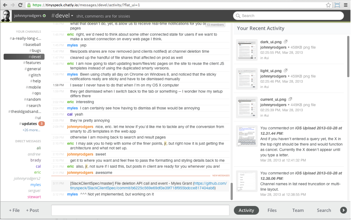
Finally, the member list showed who had joined the channel you were looking at, and who was online. We wanted presence to provide context if you needed a quick reply, or just to see who was around. However, like email, Slack didn’t require the readers of a message to be online — it would be there waiting whenever they chose to check. This felt like a key expectation to get across: Slack could work equally well for synchronous or asynchronous communication.
Our early prototypes focused heavily on resolving this requirement. We first implemented a “read cursor” in each conversation to keep track of which messages you had read. This allowed a person to pick up where they left off, and quickly see if a channel had anything new to read. Our clients on the web and mobile phones synced this data so that you could start reading on your phone on your commute and then pick up right where you left off at your desk. You could mark messages as unread by moving your cursor farther back in a channel. This created a convenient marker for you to return to later.
We also wanted to alleviate the monotony of a list of similar-looking messages and make the message list feel more conversational and natural. First, we grouped subsequent messages from the same author. We knew some people liked to write messages in short bursts, while others composed longer well-punctuated notes. By grouping continuous messages under the same author, the two styles were on a more even footing. We also introduced gaps in the message list when there was a gap in conversation (no messages for 5 minutes). This made the message list visually scannable for conversation blocks that happened in real-time.
We worked to make content shared in Slack rich and inviting. We wrote code to parse website links out of messages and fetch enough metadata to present what we called “unfurls” — a block of information about the link including title, description, source, and often an image. This data (made available by meta tags embedded in most public websites) turned a bare URL into a big visual preview for readers of the message. This made it possible to share and talk about content and media in Slack in a way that felt entirely different from link sharing in email or other chat clients at the time. Tweets, YouTube videos, and news articles all unfurled in channels alongside uploaded photos.
Good enough for us to use full time
Taken together, these early attempts at breathing life into messages gave the Slack client a more humane, less nerdy appearance than IRC or other chat apps. Compared to a deep email reply chain containing the same messages, Slack was far easier to read and keep up with.
Other critical components of the first prototype: files and search. We wanted it to be easy to add stuff to Slack and find stuff in Slack. To add a file, you could drag and drop it from your computer onto Slack, pick it with a button, or – if you knew the keyboard shortcut ctrl-cmd-shift-4 then cmd-v – paste it directly from your clipboard.
If it was a file from another tool like Google Docs or Dropbox, you could send the link in a message and the file would be automatically fetched and unfurled in the channel. All of this was indexed for search alongside your message text. Upload a PDF? Its contents are now searchable. Share a Google Doc? All the text within it is now indexed and findable in Slack.
This became the centerpiece of the demo Stewart gave to our board of directors in early February, a month after we got to work. He composed a new Google Doc in one window, shared the link to Slack, then searched Slack for a phrase in the doc. There it was, alongside the context in which it was shared. The board members were suitably impressed.
This was the crux of Slack’s value. All the disparate digital tools of the modern workplace unified by a searchable messaging layer. Everything is a message. No more wondering where you read a piece of information. No more hunting around for files. No more forwarding email threads. Everything your team discussed was in one place, organized and indexed and shareable.
At this point we decided we had built enough into Slack to switch over from IRC. It was February 14th, 2013. A month after we started building and a year before we would launch to the public. Stewart made the announcement with his characteristic tongue-in-cheek humour:
“NO MORE WORK TALK ALLOWED IN IRC! $500 fine per incident.”
We were living on Slack. It was not just good enough for us to use full time — in many ways it was better than what we were leaving behind.
Good enough for some trusted friends to try
We immediately began thinking about how to get this early Alpha build of the product into customers’ hands. Stewart was fond of saying that none of us was smart enough to anticipate all the ways that people would use our multiplayer software. The best way to ensure we didn’t drift away from those needs and expectations was to get people using it.
Top of mind: friends with startups who might be obliged to begin using Slack before it was really ready or polished. Thanks to the team’s history in the world of tech startups, volunteers weren’t hard to come by.
Onboarding teams at these companies would be a somewhat manual process — we hadn’t built any sophisticated signup flows or new user education. We would manually invite new teams and generate links for them to join. We also hadn’t yet built any kind of import flow or email integration to bring a team’s existing communication into Slack. We were asking people to take a leap into something new and different without many pathways or guardrails, but with the promise of redefining how they worked together.
Stewart suggested they quit email for a week and do all of their internal communication in Slack. He recognized that the test wouldn’t work if some of the team stayed on email and conversations became fragmented. We wanted teams to go all-in on Slack and tell us what was missing.
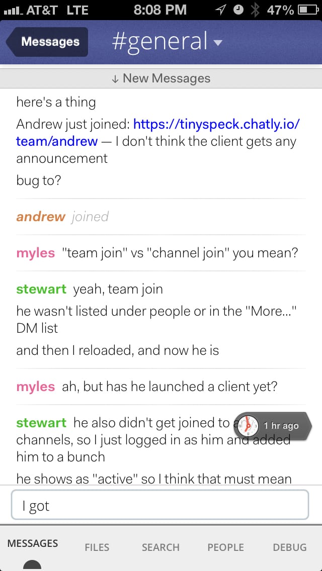
Our first surprise was that teams much larger than ours wanted to try Slack. One of the first was Rdio. We were big fans of their gorgeous music-streaming app, and were happy to get their feedback on what we had built so far. So far Slack hadn’t been used by more than eight people, and we had speculated that it might scale up to teams of about 100, or 150 at most. Rdio had over 300 people at the time.
This led to an immediate round of bugs to do with performance and the scale of the interface. On our internal team we had a couple dozen channels and eight coworkers to attend to. In practice we worked almost entirely in our #general channel — one of the two default channels on each team — with side channels for automated messages and social conversations (like #theoldgodsandthenew, our Game of Thrones channel which persists to this day).
At Rdio, they quickly spawned hundreds of channels and DMs with one another. They had clearly defined departments and roles, and groups of people who did not overlap in day-to-day communication. Interfaces that we had been looking at with a small list of items now needed more thought.
We updated the product to handle longer lists and optimized workflows that had slowed down under increased usage, like channel switching. We wrote code that trimmed the DM list to remove conversations you hadn’t used in a while. We added a Mute feature so you could join a channel but reduce its prominence in the UI (no notifications, dimmed and deprioritized in the channel list).
We noticed that our early alpha testers were starting to add prefixes to channel names so they could group them in their sidebar: things like #design-mobile and #design-desktop, or #sales-america and #sales-asia. It turned out that the software we had built for ourselves was working pretty well for companies in very different circumstances than ours.
Learning from customers
We learned these things by talking directly to the teams using Slack. We read and responded to every piece of feedback we received. We built a slash command into the apps that allowed people to send feedback effortlessly while they were using the product:
/feedback when I scroll to the bottom of the channel list the last item gets partially obscured by my profile link
Or:
/feedback I really wish I could limit the number of notifications I get in busy channels
This let people share their thoughts or report bugs from within Slack without breaking their workflow. This lowered the barrier to sharing feedback and led to a higher frequency of reports. Some of these reports were trivial, some were significant, but most of them were actionable.
We leveraged this further by sending feedback entries directly into a channel in our Slack team: #support-hose. Now we could read reports immediately after they were received and discuss them in context. Often this resulted in one of us making a change (to fix a bug or tweak a feature), deploying it, and responding to ask the reporter to update their client and pick up the change. This frequently happened in less than an hour. We did this dozens of times per day.
We were getting a real-world reminder about the best way to make software for humans. Make something, ask people to use it, listen to what they tell you, and then make it better.
We turned around fixes and adjustments as quickly as we learned about them. We responded to each message personally — often directly from Stewart. This pattern and the fundamental respect that it demonstrated for our customers would become essential to Slack’s early success and eventual longevity.