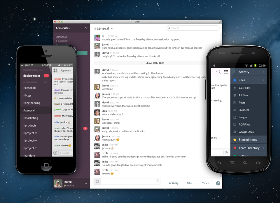
Good enough to be tried by the general public (with appropriate disclaimers)

By the summer of 2013, we knew we were on to something. The people we’d asked to try Slack – at Silicon Valley tech companies like Rdio, Medium, and ThatGameCompany – were still using it. And they were telling their friends to use it.
Small teams within companies started spreading it to other departments. We had the kind of organic word-of-mouth growth that hinted something special was happening. Each team we added, and each expansion of “seats” (the number of people at a company using Slack every day) taught us something new. They uncovered bugs which we fixed, pointed out gaps we filled, and gave us invaluable (anonymized) usage data.
What UI elements are people clicking on? When are they online? What does message volume look like? How many channels do teams create? Are they more likely to share pictures, code, or spreadsheets? What does a healthy team look like, and why do some drop off? It was evident from this data that a critical mass of about 8 people was necessary in order for teams to remain active, and that growth beyond that was a certain sign of a healthy team (we had designed it for our team of 8 after all).
Our own team started to grow in response. Our eager and vocal users were producing enough support volume that Ali and Stewart alone couldn’t handle it all. We began by hiring back our colleagues Carrie Stevens and MacKenzie Allyn from the Glitch era to assist with this aspect of running the service – maintaining our promise that every support request would be read and responded to by a human.
Others from Glitch also came back to join the team, mostly engineers to pick up the expanding list of tasks. We also brought on our first designer Cory Bujnowicz and first marketing hire James Sherrett. It started to feel a little less like we were on borrowed time and a bit more like we were building something people really wanted.
People started getting mad if our service went down, even briefly. As our team lived on Slack, we knew as soon as our customers did if something was wrong and would immediately scramble to fix it, apologize, and carry on. But it was as sure a sign as any that we had built something that people had come to depend upon – a sort of inadvertent Scream Test.
These incidents made us start to dedicate more time to Ops. Our servers were managed manually up to this point, with Cal, Myles and Serguei keeping track of health and scale, spinning up new boxes as needed. With a live product and people depending on the service for their work, we needed to have someone dedicated to keeping the servers up and happy. We hired Tyler Johnson, a tall laid-back Californian who fit right in and took care of things in his amiable, competent style.
Despite our growing team, we still ran almost everything out of our #general channel and a shared task spreadsheet. We didn’t waste time on processes or tools that weren’t strictly necessary, in order to focus all of our energy on making the product better.
Six months in, we were nearly ready for the “Good enough to be tried by the general public, with appropriate disclaimers” phase of Stewart’s timeline.
Polish
One thing we needed to get right before any kind of public access was a polish pass. Our customer-facing website, onboarding flows, clients, and supporting docs were a ramshackle mix of visual styles. We didn’t have a consistent logo, typefaces, or color scheme. Slack looked like what it was: a work-in-progress. It worked great but wasn’t up to the level of design quality or consistent identity we wanted to convey to our next audience, who we hoped would eventually become our first paying customers.

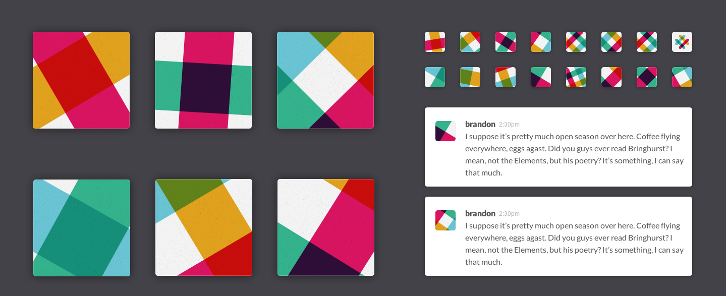
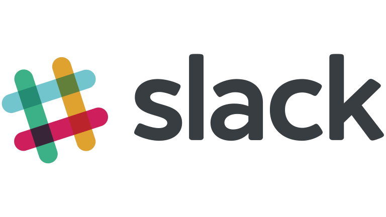
We contracted Metalab – a small design agency based in Victoria, a city on Vancouver Island – to help us out. Over a period of 6 weeks in June and July 2013, we worked with their Creative Director Brandon Velestuk and designer Moeed Mohammad to refine the UI and visual style of the clients and establish the brand of the product. This included introducing avatars into the message list (and some fun argyle patterns for users who hadn’t yet uploaded a photo), creating the color scheme of the apps, and settling on a colorful hashtag logo.
Designs in hand, we set about overhauling our clients and cleaning up everything our customers would see. We knew the value of first impressions.

A Preview Release
Stewart sent an internal memo (a public version of which was subsequently published) to the team on July 31st that started with this:
We launch in less than two weeks. We just started on a video. The “big redesign” of all our clients and website is about to begin. We have lots of ugly, unfinished user-facing bits left to clean up. We’re still testing copy for a landing page (and then we have to make a “real” one). We don’t even have a logo. But, fuck it, we’re still going to launch.
This kicked off two of the most productive weeks in the company’s history. While the layout and functionality of the product didn’t need any major changes, we did need to harmonize all of our fonts, color palettes, and UI styles. We needed to develop not just a brand, but a coherent identity.
And, crucially, we had to confront a problem that we hadn’t yet faced: how to explain Slack to someone we didn’t know using just some words on a webpage, and to convince them that it’s worth their time to give it a shot.

For most companies, the end goal of this sort of launch would be a beta release. In the world of SaaS, the word “beta” connotes a very specific phase of the software development cycle. It tells people that the software is still “wet clay” and subject to drastic changes. More crucially, it also signals to prospective users that they should expect to find a rat’s nest of bugs. People who join beta releases opt into doing the extra work of reporting these bugs and dealing with the general frustration of unreliable software — they accept this as the price of getting early access to promising new technology.
We realized that this price would be too steep for Slack. If we were asking companies to move their communications entirely into our product, very few of them would opt into it if we told them that it would be unreliable and buggy.
And, at this point, Slack truly wasn’t a “beta” product. It worked well. We’d been using it exclusively for our own communication for nearly six months. Our own intolerance for bugs that inhibited our day-to-day work meant that we fixed bugs almost as quickly as we created them; we were confident that our earliest users wouldn’t have to moonlight as our QA team.
The core features we believed every team needed to communicate effectively were completely built and integrated. The foundation of Slack was complete and set; we’d moved to the phase of adding utility, sophistication, and polish on top of it.
So, instead of launching a beta, our August 13th launch became a “Preview Release.” In the same memo, Stewart described the goals of the Preview Release:
The goal of this launch is to fill up the queue with a large number of companies/teams that would be good potential customers for Slack. Specifically, we’d like at least 1,000 signups, of which 200 are “qualified leads” (in this case, that means that the signup is coming from someone who has a chance of getting their team to use Slack and the team is the type of team that could benefit from Slack).
Following this launch, we will be triaging the most important tweaks, fixes, bits of polish, etc., in order to increase the likelihood that someone who hears about Slack becomes someone who uses Slack with their team (so, along the way, increasing the odds that they are able to get their team to try it, increasing the odds that the team sticks with it, etc.) Inviting 200 or so new teams in over the course of six weeks should give us enough learning and enough “tries” that we are able to fix the biggest problems.
The problems we were looking for during this period were our own blind spots. As a small team of people who’d spent their entire careers in software, we had no idea how our product would work in companies unlike those we’d worked in, and for people whose jobs were different from any we’d ever held.
This was not Stewart’s first time around the block. He knew how hard it was to get people to try something new, let alone stick around long enough for it to become part of their daily life. Despite our initial momentum and positive feedback from our early alpha users, he knew how important it was to get this next phase right.
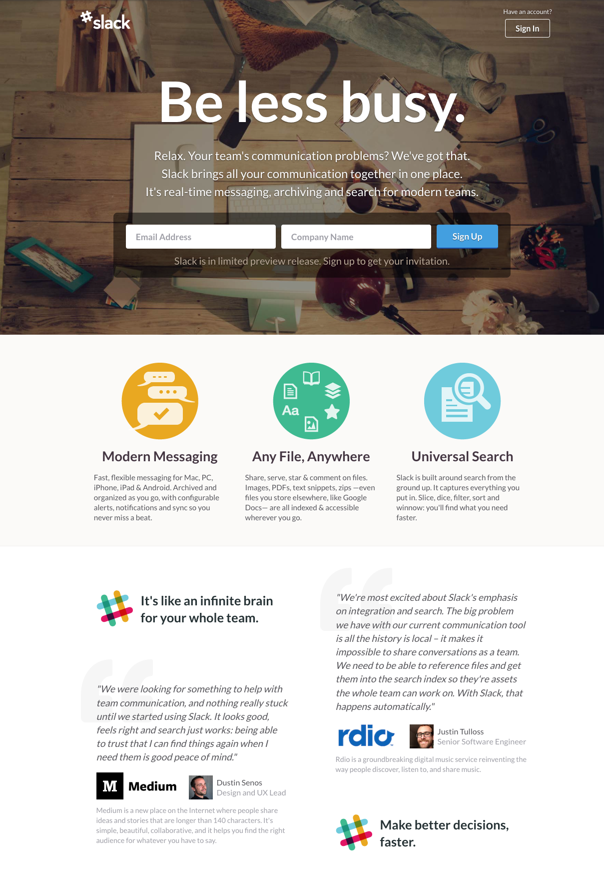
Our Preview Release went live on August 13th, 2013, complete with a new website, updated UI, and a signup form. Put in your email address and we’ll invite you when we have capacity.
On the first day, 8,000 people signed up. Within two weeks, 15,000 had signed up.
We realized that we’d have to revise our plan to bring on 200 companies over the next 6 weeks — we had to invite everyone.

